Kestava
Kestava Engineering — Visual Identity & Logo Design
Overview
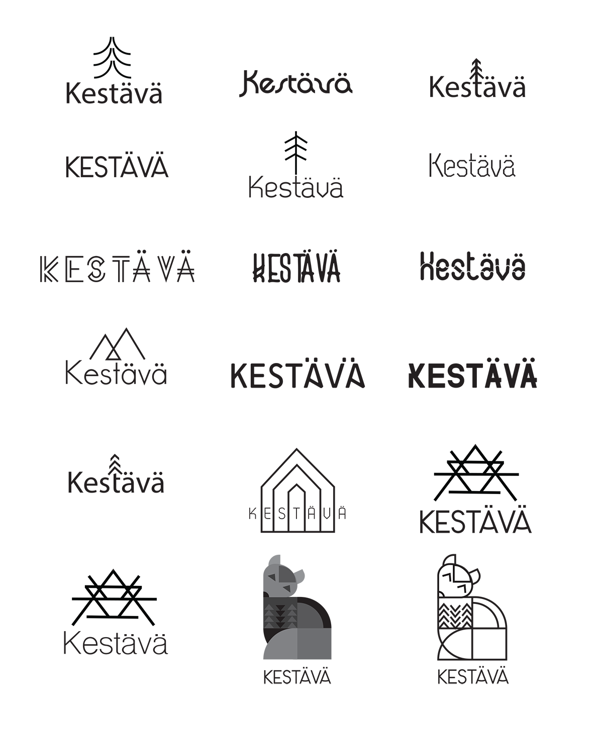
Kestava Engineering is a consulting agency dedicated to structural engineering and design, grounded in precision, durability, and thoughtful problem-solving. The goal of this project was to create a visual identity that communicates both technical strength and a deep connection to Nordic heritage and natural materials.
Concept
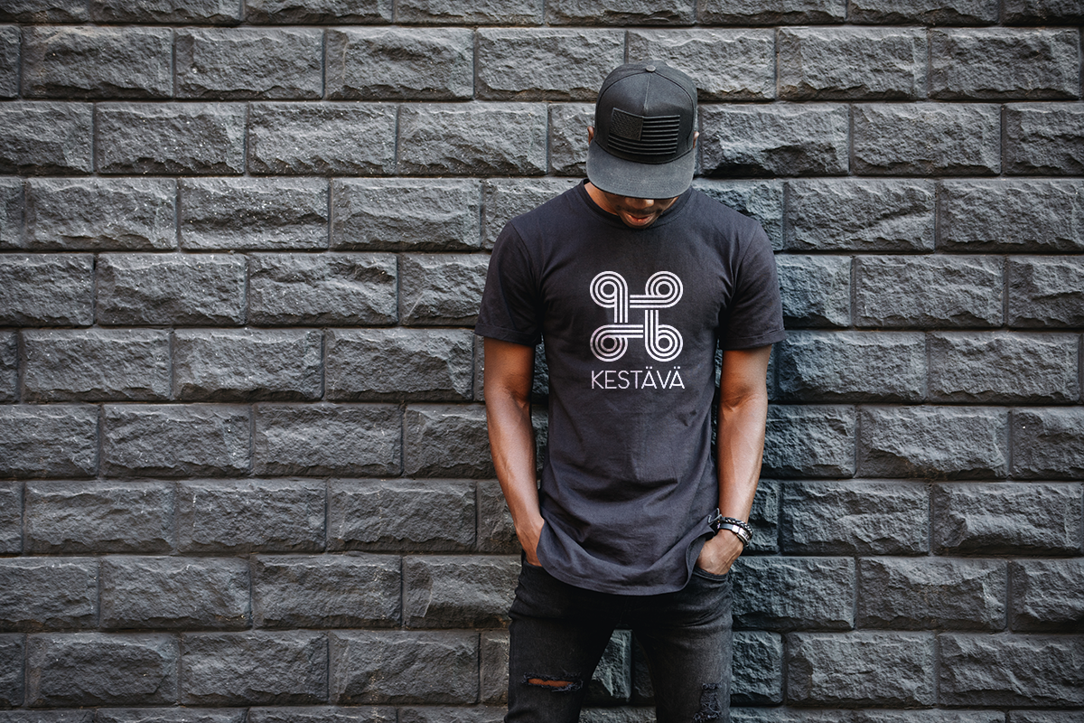
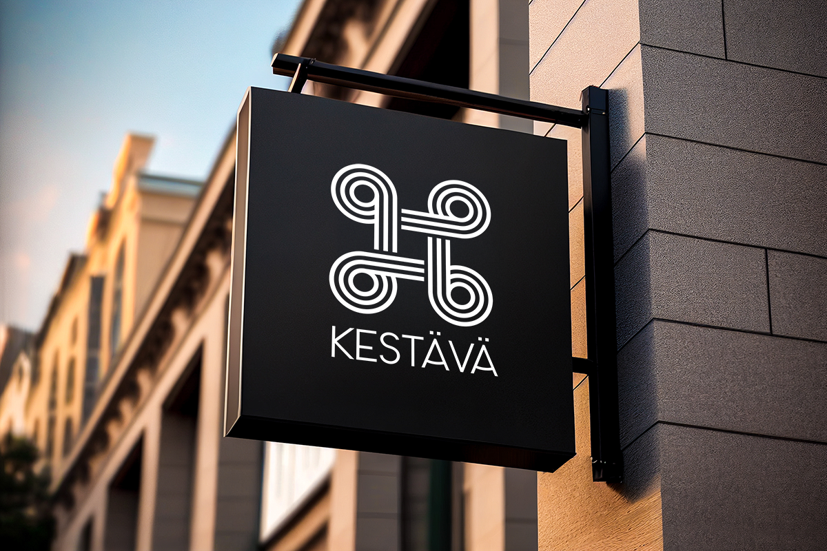
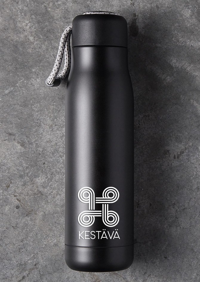
The logo is built from a continuous system of evenly weighted lines that curve into four symmetrical spiral forms, forming a balanced, cross-like structure. This geometry references Viking ornamentation and rune symbolism while simultaneously suggesting structural pathways, stability, and interconnected support—core principles of engineering. Inspiration from Nordic landscapes and natural wood textures informed the organic rhythm of the forms, balancing rigidity with warmth.
Design Approach
A restrained monochrome palette and precise, modular linework establish clarity, timelessness, and architectural discipline. The repetition of curves creates visual harmony and reflects craftsmanship, while the symmetry reinforces reliability and structural integrity. The resulting mark is minimal yet expressive, allowing it to scale effectively across print, digital, and environmental applications.
Outcome
The final identity positions Kestava Engineering as a modern, confident consultancy rooted in tradition, sustainability, and enduring strength. The logo’s blend of geometric precision and organic influence communicates both engineering expertise and a thoughtful connection to nature—forming a distinctive and memorable brand presence.